
How do I edit the design of my testimonial widget?
You can customize your widget's appearance in Senja Studio, including layout, colors, photos, and branding.
Who can access this
All Senja users can edit widget designs. Some features like removing Senja branding require a paid plan.
Edit your widget design
Go to your Studio page: https://app.senja.io/studio
Open your widget
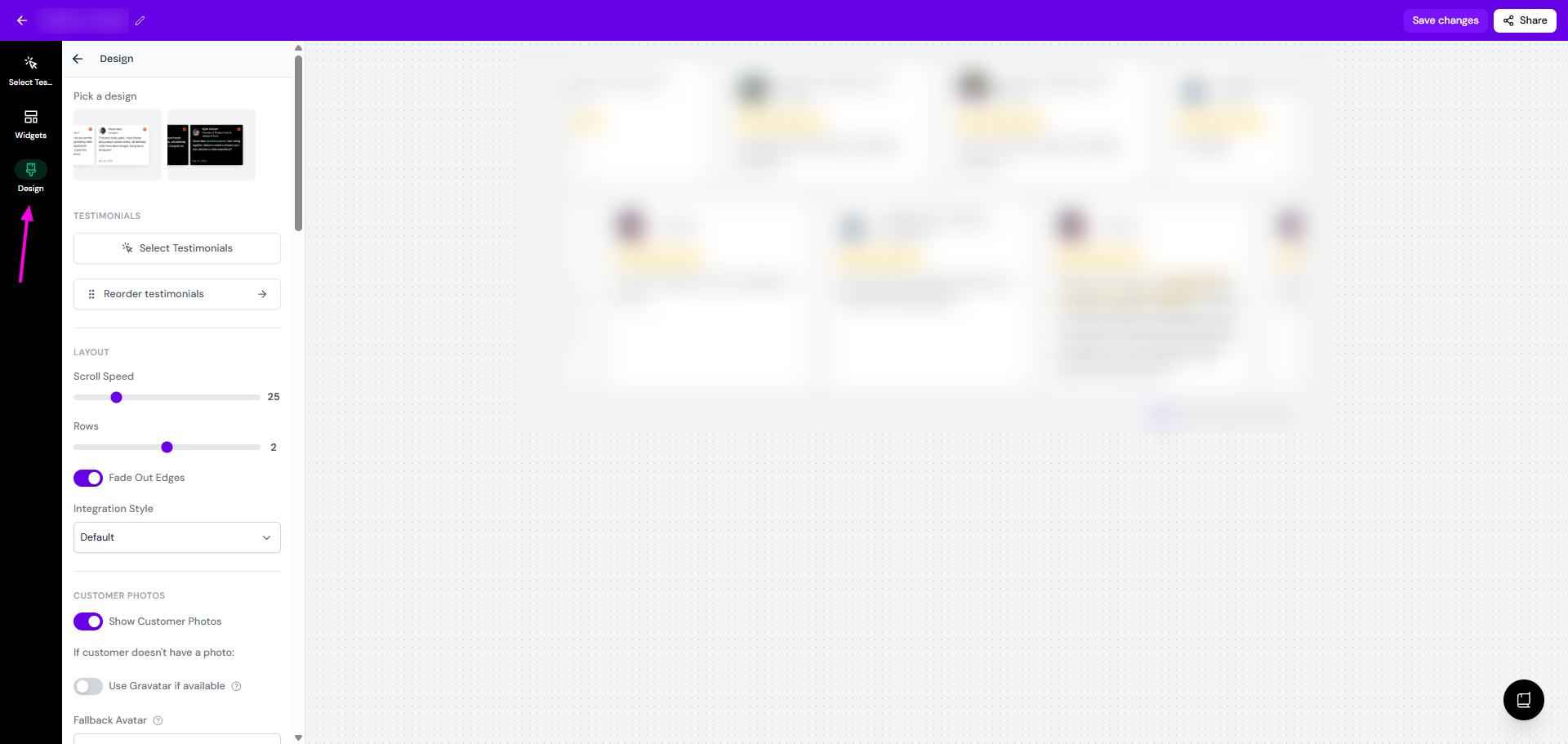
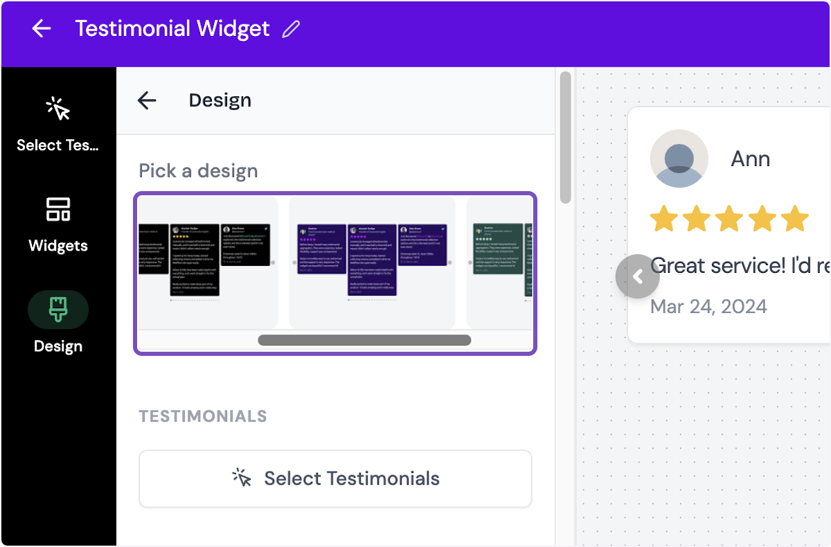
Click Design on the widget editing view
Make the changes/customizations that you want
Click Save changes when you're done
What you can customize
The Design panel lets you adjust:
Pick a design: choose the variation of the widget design (some widgets offer more than 1 option)
Testimonials
Select Testimonials: change the list of testimonials for the widget (the same function as Select Testimonials tab on the top-left
Reorder testimonials: rearrange the order of testimonials
Targeting [only on Testimonial Popup widget]
Hide on mobile: set it to hidden when someone open the page using mobile phone
Enable page targeting: limit the widget to specific pages or exclude on specific pages
Layout
Center on page: change the horizontal position to he center of the page [available on Rating Badge widget]
Layout: choose between Grid or Marquee [only for Company Logos widget]
Spacing
Set the spacing size (0 - 64) [only for Company Logos widget]
Choose between Small, Medium, Large, or Extra Large [only for Testimonial Masonry widget]
Logo Width: set the width of the company logo (24 - 256) [only for Company Logos widget]
Pulse Animation: enable/disable the beam animation on the popup [only on Testimonial Popup widget]
Position: set the position of the widget between the Left, Center, or Right side of the page [only on Testimonial Popup widget]
Alignment [only on Quote Grid widget]
Position in Center [only for Testimonial Avatars widget]
Automatically Scroll Vertically [only for some widget]
Set the Max height
Show Arrows [only for Testimonial Carousel widget]
Autoplay [only for Testimonial Carousel widget]
Max Columns: set the number of columns in display (1 - 4) [only for widget with multiple columns]
Scroll Speed
Rows/Number of Rows: set the number of rows on display
Items Per Row [only on Testimonial Highlights widget]
Size: choose between Small, Medium, or Large [only on Testimonial Highlights widget]
Fade Out Edges: set the left/right edges as blurred/solid end
Integration Style: choose Default or Floating
Customer photos
Optimize Customer Photos: boost the quality of the customers' photos [only on Avatars Pro widget]
Show Customer Photos: choose to display the customer's avatars, applicable for all testimonials - you can't choose to show only some testimonials from the list
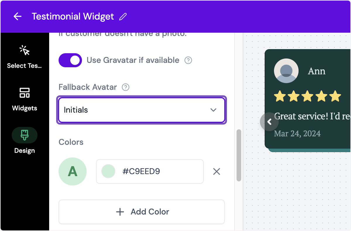
Use Gravatar if available: when it's on, the customers without avatar will be replaced by gravatar
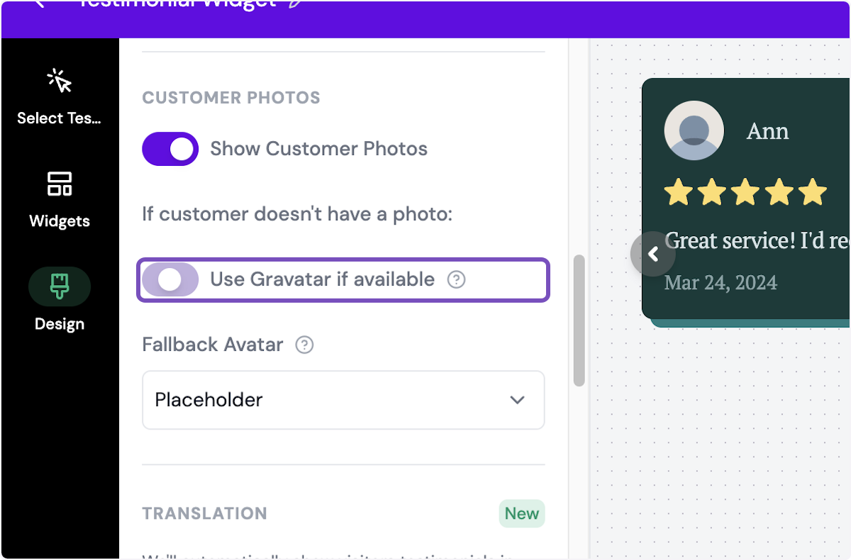
Fallback Avatar: replacement image if the customers have no avatar and the gravatar is not available, you can choose between Placeholder, Initials (you can customize the background color in HEX code), or Custom (add an image)
Translation: automatically show visitors testimonials in the languages supported in your page
Set the toggle on for Automatically show testimonials in the visitors language
Content
Text: setup the text [only for Rating Badge & Testimonial Avatars widget]
Rating Number Style: choose between Default or Large [only for Rating Badge widget]
External Link: set the link to open when someone click the widget [only for Rating Badge widget]
Center Text: place the text in the center [only for Avatars Pro widget]
Show Rating Value: show/hide the average rating only on Testimonial Avatars widget]
Open Popup on Click: set the widget to open a URL when someone click on it [only for Company Logos & Testimonial Avatars widget]
Set the CTA Text
Set the CTA URL
Title [only on Testimonial Popup widget]
Subtitle [only on Testimonial Popup widget]
Button Text [only on Testimonial Popup widget]
Call to Action Text
Load more button text [only on Testimonial Popup widget]
Call to Action URL [only on Testimonial Popup widget]
Limit Testimonials: limit the number of testimonials in display [only on some widgets]
Max Testimonials: set the maximum number of testimonials in display, the rest will be hidden and can be shown by clicking a button
Load more button label: set the label for load more function
Hide load more button: set the load more button to hidden
Show Border: show/hide the border for each testimonial box
Border Width: set the border width (0 - 12)
Shadow Size: choose the shadow setting from None, Small, Medium, Large, and Extra Large
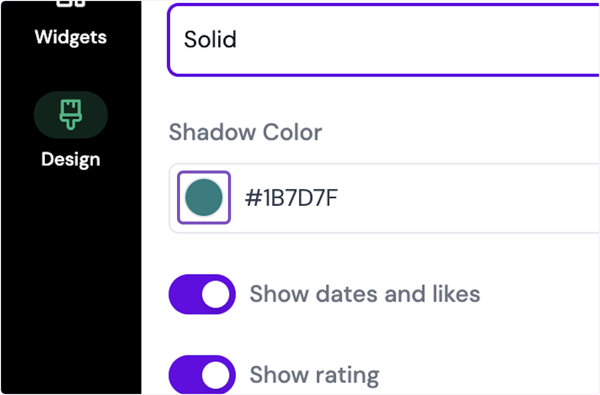
Shadow Style: choose between Blurred or Solid
Shadow Color: set the color of the shadow, in HEX code
Border Radius: set the roundness of the boxes' edges, between None, Small, Medium, Large, and Extra Large
Show dates and likes: display/hide the testimonial collection date
Show rating: show/hide star ratings
Show text excerpt on video testimonials: display/hide a brief text on video testimonials
Show testimonial titles: show/hide the testimonial titles
Show image attachments: show/hide images (for testimonials that have images attached to it)
Shorten long testimonials: show shortened version of long testimonials
Max lines: set the maximum number of rows
Read more text: set the label of read more CTA
Read less text: set the label of read less CTA
Show Quotes [only on Testimonial Highlights widget]
Use Highlights: show/hide highlights [only on Social Star widget]
Show Highlights: show the highlight marker on the testimonials that have highlight on
Colors
Grayscale [only for company logo widget]
Primary Color
Background Color
Text Color
Rating Color
Rating Border Color
Rating Number Background [only for star-rating widget]
Border Color
Highlight Color
Typography > Font: choose the typeface
Filters: add a filter for the viewer to choose parts of testimonials to display [only on Testimonial Masonry widget]
Remove Senja branding: only applicable for paid plan, to remove the label Collect testimonials with Senja
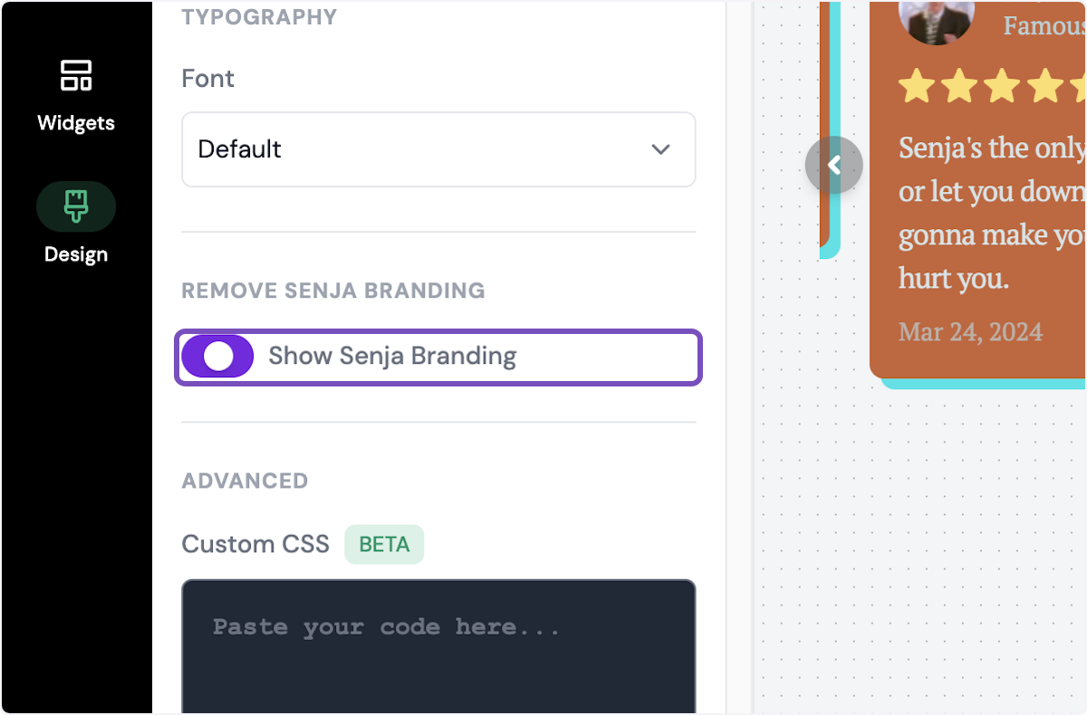
Advanced > Custom CSS: add custom CSS to set width, use custom fonts, etc.
Read Can I customize my widget CSS? article
Each widget has different customization options, some design feature might be available in widget A, but not in widget B.